Western Legacies | Logo Reveal
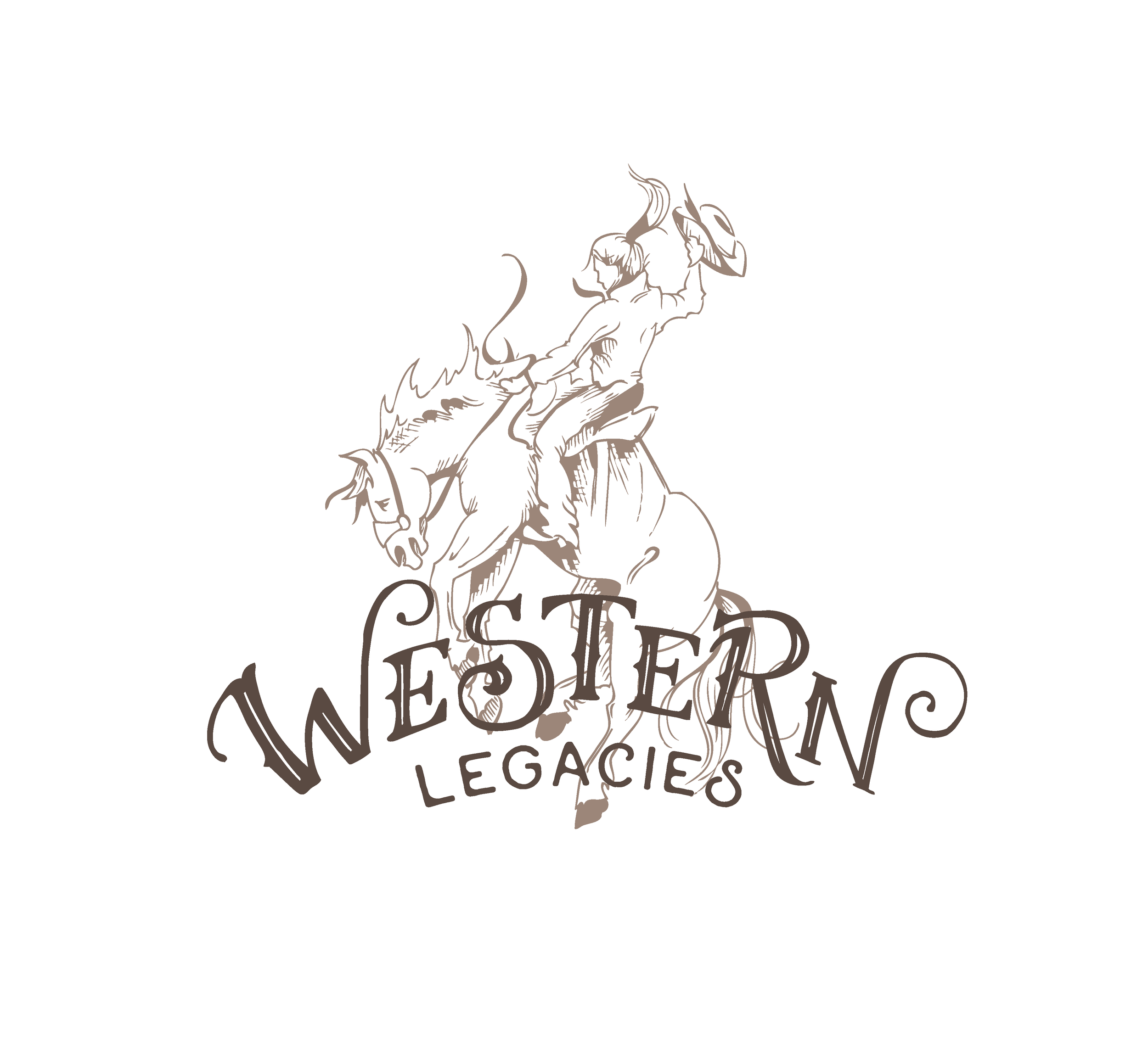
Here it is, my latest logo creation! This logo is for Western Legacies - a photography team with a passion for capturing the western way of life. Jordan & Krystal, the hard-working cowgirls behind this company (& behind the lens) wanted a logo that had a retro cowboy feel, with a tooled-leather look, and very indicative of their pride in the western, ranching way of life.
I loved that when I asked them to describe their aesthetic, they told me they wanted their logo to have the same feel as this quote:
“I want to be beautiful the way worn out things are. Touched by time & proud to be rough around the edges with a story to tell.”
The predominant 'Western' script is hand-lettered, and the logo artwork is hand-drawn. As you can see, we created several different versions of the logo, as well as a text only version to be used as a watermark on the client's photography. I believe in the power of variety & versatility in my logo designs, and like to give my clients several logo options for their marketing needs.
Thank you Jordan & Krystal for this opportunity! And thank you for strong ideas & inspiration - I love the final result!
Thunderbird Collective | Logo Design
Introducing: Thunderbird Collective | Logo Reveal
I'm so incredibly excited about this logo. When Alyson came to me with her ideas for this project, I was over the moon. I have created artwork for Alyson before, and she is always wonderful to work with - positive, enthusiastic, and full of incredible ideas. She's what this graphic designer's dreams are made of.
This logo is for Alyson's soon-to-be online boutique Thunderbird Collective. She describes it as a 'ranchy meets boho' specialty boutique with eclectic tees, apparel, accessories, and home decor.
Thunderbird Collective | Logo Design
When I asked who her ideal customer was, she said her customer is 'female - early twenties to sassy 60's and has an appreciation & love for the past and vintage. She's an old soul. She has a deep emotional connection to old barns & old pick-up trucks. She would prefer to spend the day sipping sweet tea and eating buttermilk pie on her family's front porch. She most likely has a strong agricultural background. She has simple roots & big dreams.' Oh, and she listens to Miranda Lambert, The Eagles, Waylon Jennings and Fleetwood Mac. Do you understand now why I love this lady's vision. She descriptive, specific, and right up my alley. LOVE.
We agreed that the logo should feel a little bit country, but a little bit 70's rock-n-roll. Vintage and nostalgic, feminine yet bold. I am so excited & proud of the finished product. The logo is entirely hand-lettered and hand-drawn - which adds an approachable & vintage western vibe to the bold, simple thunderbird emblem.
Since her vision was so deliciously specific, and it would be a shame not to, I have also shared the mood board I designed inspired by her dreamy descriptions, as well as the several different versions of her logo that I created, plus a few collateral items.
Obviously, you need to stay tuned, because the Thunderbird Collective is what every dirt-road-driving, road-trip loving, graphic-tee wearing, day-dreamer needs in their life. I am so thrilled.
Thanks for allowing me to be a part of this project Alyson. I CAN NOT WAIT to see what's next.
Thunderbird Collective | Mood Board
Inspired by Alyson's description, I created this little piece of hand-lettering to help embody the Thunderbird Collective brand.
Logo Reveal | The Healing Ride
I created this logo for a fellow horse-woman and friend, Charlene Waddell - who just recently started a business offering support and resources for people interested in red light therapy and aromatherapy. The company's goal is to provide natural therapeutic opportunities and performance support for people, their horses, and pets. Charlene is a distributor for Young Living essential oils and a brand rep for Photonic Health alternative & holistic health services.
The process of creating a logo for Char began with a 'mood board' - with the goal of capturing the feel & aesthetic she was looking to encapsulate in her brand. We both agreed her brand should be warm, approachable, and soothing with a little bit of a western accent.
From there, I was able to begin drafting ideas.
After sending Char some options, we agreed upon the primary logo design that appears in the first image. But, I like to offer secondary branding elements & complimentary logos to clients when I can - I find it helpful to give my client multiple branding options for them to use throughout their marketing strategy. For example, Char didn't want her company to only appeal to horse owners but also have elements that would speak to her human clients and those interested in using her services for their smaller pets. While the primary logo is captivating, I wanted to provide her with logo elements that she could use to for non-horse related marketing items. The complimentary branding elements are more simplistic & less "equine specific" but still embody the therapeutic and approachable feel she was going for, while also staying 'on brand.' The secondary logo designs allow the brand some flexibility and dimension - to support the primary logo or create brand interest.
Here are some of the secondary branding pieces I created:
If you're interested in the services The Healing Ride provides, there will be a website up and running soon. In the mean time, you can find more information & get in touch with Charlene through her Facebook page - here.
A Spark of Hope | Logo Design & Workflow
A behind-the-scenes look at a logo I designed for A Spark of Hope; a company dedicated to finding loving homes for dogs, cats and horses.
Read More


